Logo Branding Guide
When we build webpages and emails for your church—especially Plan Your Visit, You’re Invited, and follow‑up communications—we use a set of standardized logo files to ensure everything looks professional, readable, and consistent across devices.
This article explains what each logo is, where it’s used, and why we choose it, so you can feel confident in how your church is represented.
Why We Use Multiple Logo Versions
Different environments require different logo treatments. A logo that works great on a white website header may not work inside a dark email footer or a small mobile icon.
To avoid distortion, poor contrast, or readability issues, we use:
- Light vs. dark versions (for contrast)
- Horizontal vs. stacked layouts (for spacing)
- Icon versions (for small spaces like favicons and buttons)
Logo Files, Sizes & How They’re Used
Below is the complete list of logo files we use, shown as PNGs, along with their pixel dimensions and primary use cases.
1. Primary Logos (Horizontal · Default Branding)
Files & Sizes:

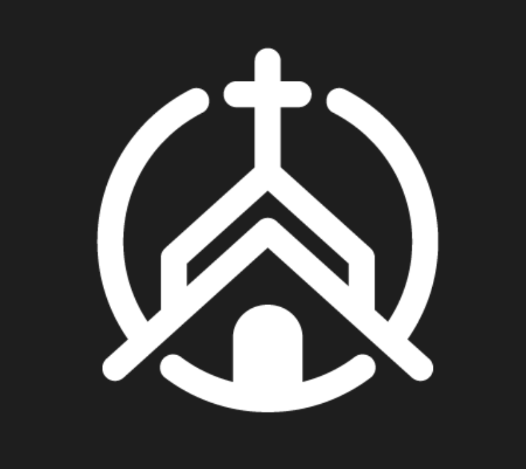
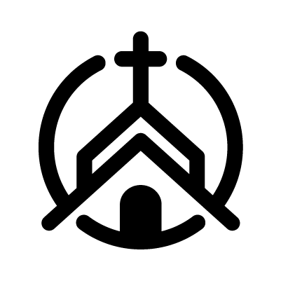
Youre-Invited_Primary-Dark-Logo.png — 450 × 120 px

Youre-Invited_Primary-Light-Logo.png — 450 × 120 px
Where they appear:
- Primary website headers
- Email headers
- High-visibility branding areas
How we choose:
- Dark → light backgrounds
- Light → dark or photo backgrounds
These are the most commonly used logos and represent the standard brand presentation.
2. Horizontal Logos (Alternate Horizontal Treatment)
Files & Sizes:

Youre-Invited_Horizontal-Black-Logo.png — 450 × 120 px

Youre-Invited_Horizontal-White-Logo.png — 450 × 120 px
Where they appear:
- Website sections with wide layouts
- Email sections that require strong contrast
Why these are used:
They offer flexibility when color usage or contrast requires a simpler black or white treatment.
3. Primary Stacked Logos
Files & Sizes:

Youre-Invited_Primary-Stacked-Dark-Logo.png — 800 × 500 px
Where they appear:
- Landing page hero sections
- Prominent branded moments
- Centered layouts where vertical balance matters
This version is used when the logo needs to be visually strong and immediately recognizable.
4. Stacked Logos
Files & Sizes:
Youre-Invited_Stacked-Black-Logo.png — 800 × 500 px

Where they appear:
- Mobile-first designs
- Narrow content areas
- Centered sections
Stacked logos maintain clarity when horizontal space is limited.
5. Icon Logos (Square · Small Spaces)
Files & Sizes:
Youre-Invited_Icon-White-Logo.png — 400 × 400 px

Youre-Invited_Icon-Color-Logo.png — 400 × 400 px
Youre-Invited_Icon-Black-Logo.png — 400 × 400 px
Where they appear:
- Buttons
- Mobile layouts
- Section dividers
- Compact brand placements
Why icons are used:
They preserve brand recognition when space is limited and a full logo would feel crowded.
6. Favicon (Browser Tab Icon)
File & Size:

Youre-Invited_Base-Favicon.png — 30 × 30 px
Where it appears:
- Browser tabs
- Bookmarks
- Mobile browser headers
This file is optimized for clarity at very small sizes and is never used in full-page layouts.
What Church Fuel to do a brand package for you?
Your church only gets one first impression.
If your logo, colors, and pages feel inconsistent, guests notice—and trust drops before they ever visit.
The Church Fuel Brand Package gives your church a complete, professional brand system built for websites, emails, and first-time guest experiences.
You get:
- Clean, consistent logo versions (light, dark, stacked, icon)
- Sizes optimized for web, email, and mobile
- Branding that plugs directly into Church Fuel pages
- Optimized photography
- Coaching session with a Church Brand Expert
No guesswork. No resizing. No design headaches.
Just a clear, trustworthy brand that helps guests feel confident taking their next step.